Thursday, November 13, 2008

In good company


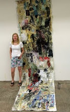
Drawing on the top is Eric White'

If it’s true, that drawing is a way of thinking, then this is an example of not-thinking about the drawing.
The method applied here is efficient at times when I am getting stuck with figurative representation, as mark making executed in the manner of Brownian motion accidentally could lead to the recognizable subject matter.

Uncut version: That elastic minded drawing was made during namesake panel discussion, when I was done drawing horses and imaginary landscapes, besides lighting was off most of the time.
Long story short, it was submitted for a group show of drawings Move 16:
Don’t Paint With Your Teeth, curated by Rich Jacobs, at Cinders Gallery in Williamsburg Brooklyn, NY.

Sunday, November 9, 2008

The Academy, week 1

Shortly after graduation, I was enrolled in The Illustration Academy, hosted by the Ringling College of Art and Design that was an once-in-a-lifetime experience, enriched by the thoughtful guidance of the faculty members and the customized approach to student needs. Additionally, meeting new friends made my stay in Sarasota so joyful. This city of sunshine was inspirational, with its white beaches, turquoise water, and fireworks on the 4th of July.

Instructors:
Mark English, Gary Kelley, Anita Kunz, Chris Payne, Jon Foster, Natalie Ascencios and Barron Storey, Robert Meganck, Scott Anderson and Robin Eley.
The full-time faculty:
Sterling Hundley, John English, Brent Watkinson, Doug Chayka, and George Pratt.

Each week we were given an assignment by a visiting instructor. First, the instructor would present the assignment, and then the initial critique of our thumbnail sketches would be scheduled for the next morning. The final critique would occur the next Monday by the following visiting instructor.
Once the main compositional elements were approved at the thumbnail review, the selected composition would be refined over the course of the week. This next stage, the actual size drawing, is based on research, additional sketches and photo references. Although the preparatory work was laborious and time consuming, the idea was to make the transition to the stage of actual painting smooth and less worrying. However, no matter what great time management skills we had, a lot of good art was happening at all hours of the night and into the morning.
The curriculum consisted of studio hours, presentations, demonstrations, lectures, and life drawing classes. There was a lecture week in the middle of the program, when students did not have any assignment to work on.
We were lucky to get
Jillian Tamaki and Sam Weber to come for the lecture week and to find time to visit studios and to talk to students. I truly hope they enjoyed their visit as much as we did.
One of my brightest memories of Academy was
Barron Storey and his sketchbooks. During his demonstration Barron worked on three pieces over the course of four hours, with undivided attention from the audience. One was a poster, a second was portrait based on his sketchbook drawings, while third piece was a quick panoramic drawing of the students, who were greatly impressed by Barron’s creativity, engaging conversation, and amazing sketchbooks.


thumbnail sketches


color studies


Final composition, acrylic on textured paper

Mark English Assignment
The first assignment was to create a dynamic composition with recognizable elements of the sunlit Florida landscape and a corresponding color palette, using 2 values per shape.
There were several attempts to construct pleasing swatches/patches of color arranged in pattern-like pictorial space. The final was a variation of a cityscape, organized into a pattern of forms carried through to abstraction. The presence of the orange woman is a reference to the Florida’s state color and state fruit.
Acrylic when applied properly on the right surface is usually helpful in creating flat colorful shapes. However, the descriptive powers of line work had let me down on this.

Lolita in America


initial sketch of napping Lolita


finishes: Gouache, digital

Students at Jordin Isip' senior concepts class were asked to submit entries for
LOLITA in America Conference poster/program.
A Symposium to Commemorate the 50th Anniversary of the Publication of LOLITA in the United States was held by The New School's Department of Humanities in fall 08.

Torino Book Fair, May 2008


"I Love You" Book: five linocuts, self-generated typeface, French binding

Credits:
concept: Sergio Ruzzier
print: Martin Mazorra
linocuts: mine

Several hand-made books from Parsons Illustration Department were showcased at the Book Design Space at The International Book Fair of Turin. My book could be seen at the upper left corner of the picture.
Detailed description of the event at http://parsonsillustration.wordpress.com/2008/07/14/guest-entry-cat-lauigan-on-the-torrino-book-fair/

Photo credit: Cat Lauigan

Bar Scene


Last winter the sleek narrow bar (L.E.S.) was housing its quarterly group art show. 
My artwork was mostly prints (at the photo) and a few oils. 

Little Red Riding Hood

Nobody said it would be easy once you are dealing with magical creatures. There is something about gnomes, goblins, gargoyles and other fabulous ones in the present classification... Being a loyal follower of faeriegnomes aesthetics, I took one step further to create a little dwelling hiding in the shade. The project started this summer after i found a nice mushroom who agreed to model for the piece, and it is still WIP.


Drawings from observation


Gone Green

Client: Tom Cody Design
Assignment was to create a T shirt design, which should have the look, feel, theme and color palette as the TC collection, inspired by Summer Lovin' Art of the Psychedelic Era.

Initial Sketch and Final